A client retention plan is a short set of repeatable habits for every stage of a client relationship, from the first welcome message to the follow-up after the project ends. For a freelancer, the plan that works is the one you can run in about 20 minutes a week: one...
Yes, AI can take your meeting notes. It records or listens to the call, turns speech into a transcript, and has a language model write a summary and a list of action items. The tools are the easy part. What decides whether AI meeting notes help you is what happens...
A CRM with a calendar puts your client records, meetings, tasks and follow-ups in one place, so every call you schedule is tied to the person and the deal behind it. For a freelancer or solo business owner, the best choice is the one that shows your client work next...
AI can turn your income, bills and goals into a working monthly budget in minutes. It can also categorize spending, explain budgeting methods and test “what if” scenarios. It works best when you give it real numbers, tell it which method to use, and check the output...
A recurring task is any piece of work that comes back on a pattern: the weekly invoice run, the Tuesday workout, the monthly tax set-aside, a client’s birthday. The best way to manage them is to decide two things for each one: what triggers the next copy (the calendar...
A life operating system (often shortened to Life OS) is one connected setup where your goals, projects, tasks, calendar, notes, money and habits live together and inform each other. A to-do list only stores actions. A life OS also tells you why those actions matter...
The most reliable way to plan work and personal life together is to stop splitting them. Write every commitment into one inventory, put it on one calendar, rank it by importance and urgency, give it a block of time, and review the plan weekly. The rest of this guide...
A calendar time audit is a review of what your calendar says you did over the past few weeks, set against what you say matters. You export or scroll back through four to eight weeks, sort every block into a handful of categories, add up the hours, and compare the...
TL;DR A goal only becomes real when it has a date, a duration and a place on the calendar. Recurring blocks are one of the simplest ways to do this. Structure goals in layers: one or two main missions, projects that act as milestones, and daily actions. Plan, then...
Use a list when your tasks are short, independent and mostly done in one sitting. Use a Kanban board when work passes through stages, when several things are in progress at once, or when you keep losing track of what is stuck. Most people need both: a list for...
Calendar Color Coding: A Simple System That Works
A good color-coded calendar uses three to five colors, gives each color one meaning, and keeps those colors identical on every device. If you can look at your week for three seconds and see where work, personal time, deadlines and focus blocks sit, the system is working. If you need a legend, it has too many colors.
This guide shows you how to pick the categories, which color combinations are easy to scan, how to set it all up in Google Calendar, Outlook and Apple Calendar, and how to keep the system from drifting. It is written for freelancers, self-employed people and anyone who juggles client work with a personal life. Those readers need a calendar that shows both sides at once without turning into a rainbow.
LifeDesk
lifedesk.me
Bring Work and Life Into View
LifeDesk brings calendars, tasks, goals, and personal and business organization together in one app, helping you keep a clearer view of your commitments.
Color coding means assigning colors to events according to rules you define in advance. Its value is speed: your eyes sort entries by color before you read a word, so you can tell a client call from a dentist appointment without opening either.
It also answers a question a plain calendar cannot: where is my time actually going? When work, family, health and admin each have a color, a week that is solid red or has no blue focus time shows you a scheduling problem at once, before you live through it. That is the real payoff for people who work for themselves. Nobody else is checking whether you left room for deep work or for a life outside it.
A color-coded calendar is a reading tool, not a decoration. If you cannot read the week at a glance on a phone screen, in bright light, or at the end of a long day, the palette needs fewer colors or more contrast.
Step 1: Choose one thing the colors will mean
Before you touch a color picker, decide what question the colors answer. The three common choices are:
Encode by
Example colors
Best for
Type of activity
Work, personal, family, health
Most people, especially those mixing job and home
Client or project
One color per client
Freelancers with two to four steady clients
Energy or work mode
Deep work, meetings, admin
People who feel their week is chaotic or meeting-heavy
Pick one. A system breaks when color means both the client and the kind of work, because a single event then has two valid colors and you start choosing by mood.
For most freelancers and solopreneurs, activity type is the safest start. Client colors fall apart the moment you land a fifth client, while categories such as “client work,” “admin,” “personal” and “health” stay stable for years. If you do want to see work by client, keep that in the event title or in your project and time-tracking tools instead of spending a color on it.
Step 2: Limit yourself to three to five colors
The urge is to give everything its own shade. Resist it. Think of highlighting every line in a textbook: when everything is highlighted, nothing stands out. The more categories you encode, the less any single one pops.
A practical rule is the one-question test: every color must answer one question you actually ask your calendar. If you have not used a color on purpose in the last couple of weeks, it is clutter. A small system is also easier to remember without a legend, which matters more than how pretty the calendar looks.
Here are three ready-made starting points. Adjust the names to your life.
Balanced (four colors)
Blue: client and business work
Green: family and home
Orange: self-care, exercise, health
Gray: errands and admin
Compact and high-signal (three colors)
Red: fixed appointments and deadlines
Blue: all work
Green: everything personal
Freelancer with focus protection (five colors)
Blue: client work
Purple: protected focus blocks
Yellow: admin, invoicing, email
Green: personal and family
Red: deadlines and high-stakes events only
If you want finer detail without adding colors, use shades of one color: light blue for routine meetings, dark blue for critical deadlines. The category still reads as one family, and the shade adds the nuance.
Step 3: Pick colors that stay readable
The colors you choose matter less than how different they are from each other. Three habits keep a palette usable:
Separate the hues. Do not use two similar greens or a red next to an orange. If you hesitate between two colors, they are too close.
Save red for what is truly urgent. Red draws the eye first. If half your week is red, nothing is urgent any more.
Never rely on hue alone. About 1 in 12 men has some form of color vision deficiency, according to the National Eye Institute, and a hue-only system also vanishes in a grayscale printout. Put a short prefix or symbol in the title, such as “CL:” for client or a small icon, and favor blue, orange and yellow, which stay distinguishable for most types of color blindness.
Keep the same colors on every device. Most calendar apps sync calendar colors through your account, but if you use two different apps, check that the colors match and fix the one that does not.
Step 4: Set it up in the calendar you already use
The tools differ in one important way: some color whole calendars, some color individual events, and some do both. Knowing which is which saves a lot of frustration.
Google Calendar
Google lets you color an entire calendar and override single events. According to Google’s Workspace help, you point to a calendar under “My calendars” on the left, click More, and choose a color or add a custom one. To recolor a single event, right-click it and choose a new color.
The efficient method is to create one calendar per category (Client work, Personal, Health) and give each its color. New events then inherit the right color from the calendar they are created in, and you only override the few exceptions. If you are recoloring half your events by hand, your calendar defaults are wrong, and it is quicker to fix the defaults than to keep overriding.
Outlook
Outlook uses color categories. Microsoft explains that color categories in Outlook can be applied to meetings, appointments, emails, notes and contacts, that you can assign several to one item, and that you can rename and recolor them. A category you apply to a meeting you received only changes your own view, not the sender’s.
Name categories by type (“Deep work,” “External,” “Personal”) rather than by one-off projects. Because categories are shared between mail and calendar, the same colors then help you triage your inbox too.
Apple Calendar
On iPhone, iPad and Mac, an event takes the color of the calendar it lives in. As an Apple Community answer puts it, you can change a calendar’s color but not the color of a single event, so the way to differentiate events is to create additional calendars. Add one per category, name it, and pick its color. On iPhone, tap the calendar icon at the bottom, tap the info icon next to the calendar and choose Color.
That design pushes you toward the structure that works best anyway: one calendar per meaning, no exceptions to remember.
Step 5: Start with the fixed blocks
The fastest way to build a readable week is to color the immovable items first: client calls, deadlines, appointments, school runs. Mapping fixed commitments before anything else is the logic behind mapping shifts first when you schedule around a job, and it applies to a freelance week too. Once the fixed blocks are colored, the gaps show you where flexible work and rest can go.
Then add flexible work as time blocks. If you want a method for that, time blocking turns a task list into scheduled chunks, and the color of each block tells you at a glance what kind of work it is.
A glance test helps here. Open the week view and ask:
Is there any focus-time color at all, or has meetings color taken over?
Is there a personal color on weekdays, or only on weekends?
Are the red items few enough to count on one hand?
If the answer to any of these is no, the colors have just shown you something about your schedule that you can fix now.
How to keep work and personal life in one view
Freelancers rarely have the luxury of a separate work world. A client call can land between a school pickup and a doctor’s visit, so you need work and personal on the same screen with enough color difference that you can still tell them apart.
The simplest approach is two or three top-level colors: one family for work (blues), one for personal (greens), and one for health or family if that matters to you. Everything else is a shade or a label. Use the toggle in your calendar app to hide the personal calendars when you share your availability, or hide work calendars in the evening. iPhone Focus modes can do this automatically: you can filter so that only work calendars show during a Work Focus and hide them during a Personal Focus.
If you want a deeper approach to balancing the two sides, our guide to work and personal planning covers how to build one system that holds.
Keep it working: the monthly review
Color systems rarely fail on day one. They fail around week six, when a new kind of event appears and you invent a color for it. A short routine prevents this:
Every week (10 to 15 minutes): recolor anything that changed status, delete events that never happened, and check that no color has quietly come to mean two things.
Every month: retire any color you have not used on purpose, and merge categories that overlap.
Every quarter: look at the week views of the past three months. Is the proportion of colors what you intended? If you meant to protect two focus blocks a week and see none, the problem is the schedule, not the colors.
That last step is a light version of a time audit. For a fuller method of measuring where the week goes, see our guide to calendar time auditing.
Avoid three common mistakes: a color per person, which multiplies categories without ever stopping; similar shades that you cannot tell apart on a phone; and redesigning the palette every few weeks, which forces you to relearn it each time.
What to look for in a color-coded calendar app
A calendar app is only the starting point, because color coding only helps if the rest of your planning matches it. When you choose a tool, look for:
Calendar-level colors with event overrides, so most events color themselves.
Separate views for work and personal, which you can show together or apart.
The same colors across web, iOS and Android.
Tasks, goals and time in the same place as events, so a deadline on the calendar is tied to the work behind it. This is the difference between a calendar and a to-do list, which our piece on calendar vs. to-do list explains.
Goals that become scheduled blocks.A calendar with goals lets a target become dated work instead of a wish.
Where LifeDesk fits
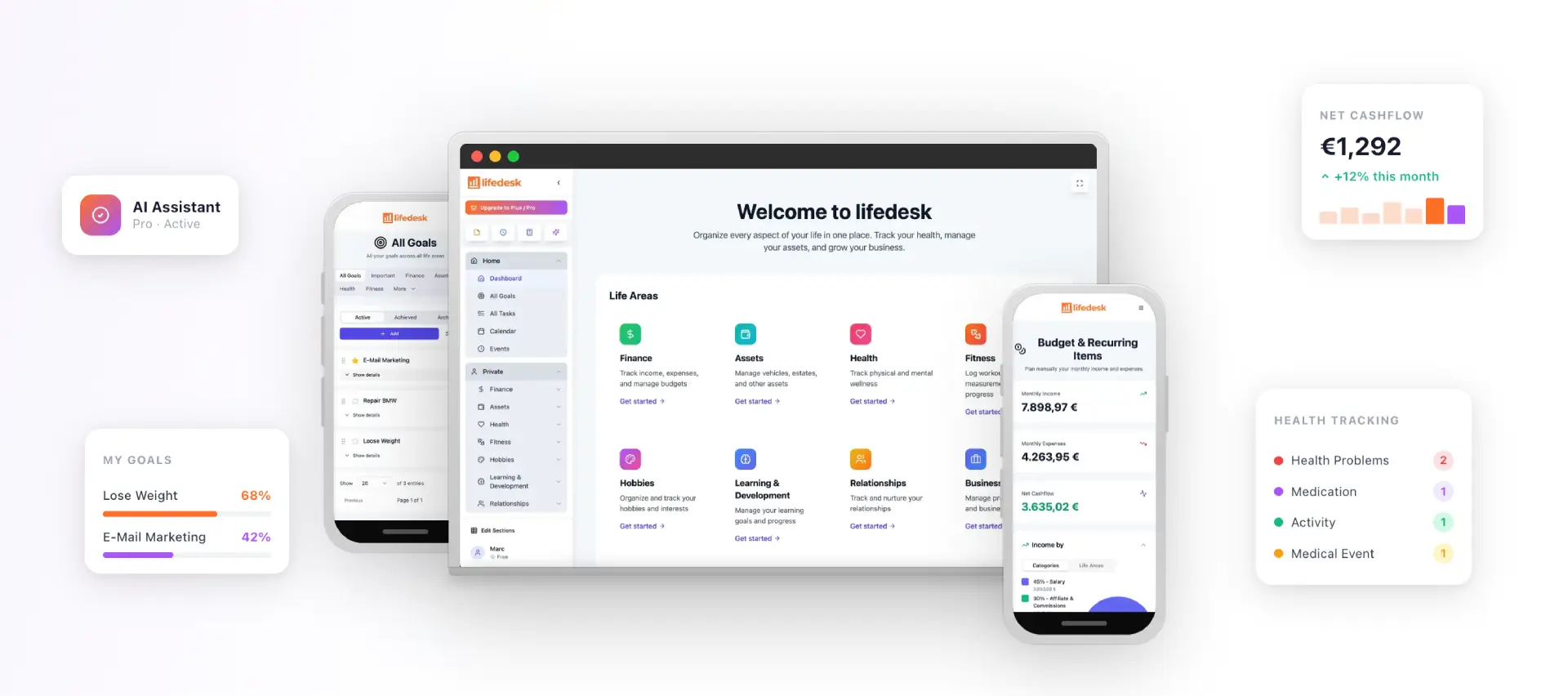
If your calendar is only one of several apps you juggle, a color code can only do so much. LifeDesk is an all-in-one app for web, iOS and Android that brings tasks, goals, calendar, finances, health, fitness and business organization into one place. Private and business management are kept in separate but accessible views, so the work-versus-personal split you build with colors has a home in the structure of the app itself.
The Free plan costs $0 per month. Plus is $9 per month and Pro is $19 per month, with premium features such as bank account connections, higher limits and an AI assistant on the paid plans. You can compare them on the LifeDesk pricing page.
If you want to see how the whole system fits together, start with the free plan and build your first week there.
Frequently asked questions
How many colors should a calendar have?
Three to five for most people. Many people can hold about five to seven categories in working memory without a legend, so seven is the practical ceiling. If you need more detail, use shades of an existing color or a short text label rather than a new hue.
What is the best color for deadlines?
Red is the most common choice, and it works because it draws the eye first. That is also why you should keep it for true deadlines only. If red shows up on more than a handful of events a week, it stops signaling urgency.
Should I color by client, by project, or by type of work?
Start with type of work, such as client work, admin, personal and health, because those categories stay stable as your clients change. Color by client only if you have a few long-term clients, and never mix both in one system.
Do I need separate calendars for color coding?
In Apple Calendar, yes: events take the color of their calendar. In Google Calendar and Outlook you can color single events as well, but separate calendars (or consistent categories) mean new events color themselves, which keeps the system easy to maintain.